Using classroom data to drive instruction and improve outcomes
Transform classroom data into actionable instruction with this educator's guide. Learn to collect, interpret, and act on evidence for better student outcomes.
Nikki Muncey • Aug 20, 2025
Student Insights & Intervention
Collect, interpret, act: this three-step roadmap transforms classroom information into actionable instructional decisions. Whether you're overwhelmed by spreadsheets or struggling with scattered assessments, this approach builds on your teaching expertise without adding to your workload.
We'll show you how to streamline evidence collection, identify meaningful patterns, and implement differentiated lessons that reach every student. We address real challenges like limited prep time, disconnected systems, and building team confidence through practical examples from teachers who've made this work.
This isn't another theoretical framework but a practical playbook built by educators who understand your need for solutions that fit your classroom reality, respect your expertise, and deliver meaningful results for your students.
What we mean by classroom data
Classroom information is any evidence you gather to understand what and how your students are learning. It falls into two broad categories that work best when combined.
Types of classroom evidence
-
Quantitative evidence — test scores, digital quizzes, attendance tallies, frequency counts, even interval sampling of on-task behavior give you crisp numbers to track progress and spot gaps.
-
Qualitative evidence — captures the story behind those numbers: anecdotal notes, student work samples, reflections, observation records, and interviews that reveal thinking and motivation.
Before adding new tools, take stock of the information you already collect. Your latest assessment scores, daily attendance and behavior notes, samples of student work, and informal reflections or observation logs all provide valuable insights into student learning patterns and needs.
Collecting charts isn't the goal; taking action drives results. Blend the reliability of numbers with the nuance of stories, then convert both into timely instructional moves. Folding exit tickets, observation notes, or automatic LMS reports into your daily rhythm keeps information flowing without extra work, so you can respond while learning is still unfolding.
Why data-driven instruction matters
When you treat classroom information as evidence rather than after-the-fact paperwork, you create a foundation for meaningful change. Research shows that formative assessment practices significantly accelerate student learning, a finding supported by John Hattie's meta-analyses and recognized by educational organizations like the Great Schools Partnership in real classrooms.
Three key benefits of continuous evidence collection
-
Early intervention opportunities: Those quick checks you already do expose misconceptions before they become entrenched, letting you reteach targeted skills while they're still fresh. This saves you from spending weeks later trying to undo confused thinking.
-
Resource allocation clarity: Clean, centralized information can give administrators the clarity they need to direct tutoring funds, devices, and coaching support where they'll make the biggest difference.
-
Equity gap identification: Perhaps most importantly, when you disaggregate your results by student subgroups, you surface equity gaps that might otherwise remain hidden. This practice ensures your resources and instruction reach the learners who need them most.
Used this way, your classroom information becomes a professional growth partner. That quick exit-ticket chart revealing half your class still struggles with fractions? Tomorrow's mini-lesson can target exactly that skill. Conversely, a snapshot showing universal mastery of a concept frees you to enrich with real-world problem solving that challenges every student to think at higher DOK levels.
Overcoming common barriers to effective data use
You're not resistant to information, you're short on time. National surveys consistently identify time as the top obstacle, so try 10-minute "evidence huddles" immediately after each assessment. A unified spreadsheet with conditional formatting turns those quick meetings into focused action without adding to prep time.
Five common challenges and practical solutions
- Time constraints
-
Solution: Schedule brief, focused "evidence huddles" rather than lengthy data meetings
-
Benefit: Turns assessment results into immediate action steps
- Scattered platforms
-
Solution: Pull everything into a single dashboard
-
Benefit: Reveals connections you'd otherwise miss and cuts search time in half
- Information overload
-
Solution: Begin with priority standards and track only 2-3 metrics per unit
-
Benefit: Reduces cognitive load and targets high-impact skills
- Technical skill gaps
-
Solution: Use PLC coaching cycles or micro-learning modules on analytical literacy
-
Benefit: Builds confidence with data interpretation across your team
- Fear of judgment
-
Solution: Frame classroom results as information for growth, not inspection
-
Benefit: Creates psychological safety for honest sharing and improvement
Best practices to turn data into instructional action
The four-pillar framework below turns raw numbers into clear teaching moves. Each pillar focuses on one essential habit: planning, gathering, visualizing, or acting.
Start with the pillar that addresses your biggest challenge, then layer in the others as your routines strengthen. Together, they create a continuous collect → interpret → act cycle that keeps your instruction responsive and equitable for every learner.
Pillar 1: Plan for data use with consistent routines
Weekly PLC meetings create the focused time you need for meaningful conversations about student progress. An ACT Research and Policy notes that scheduled collaboration reduces time spent hunting for information.
Keep your agenda simple: goal review → evidence share → next steps. The biggest challenge is maintaining consistency, so block the same 30-minute slot each week and add a brief Zoom option for absent teammates. When review becomes routine, you're answering Marzano's first two PLC questions (what students must learn and how you'll know)before each week begins.
Pillar 2: Gather intentional formative assessments
Start every unit with reliable baseline information, then check progress through exit tickets, quick digital quizzes, or student reflections. When students track their own growth through folders or personal charts, you're naturally supporting multiple ways for them to engage with their learning. This core principle benefits all students, not just those with identified needs.
Don't fall into the trap of collecting everything; focus on two or three metrics tied to your priority standards. If you're struggling to keep up with analysis, trim your list further. Quick, purposeful measures reveal misconceptions early enough for strategic support rather than end-of-unit scrambling.
Pillar 3: Visualize trends to surface insights
Numbers tell stories when you give them visual form. Color-coded spreadsheets, simple bar charts, or heat maps reveal patterns instantly. During your reviews, ask yourself: "What patterns surprise me, and why?"
Breaking down results by student subgroups catches significant gaps that averages might hide. Resist chasing every small fluctuation; focus on recurring patterns tied to key standards, then document your insights so they inform your next instructional moves.
Pillar 4: Connect insights to instructional moves
Transform each finding into concrete action (reteach, regroup, or enrich) with a SMART goal like "Increase student success on Level 2 DOK fraction word problems from 60% to 80% in two weeks." Educational research emphasizes objectivity and reliability; consider removing names during initial planning to reduce unconscious bias.
The most common mistake is implementing changes without measuring their impact. Close the loop with a brief post-intervention check and reflect during your next PLC meeting. This feedback cycle answers Marzano's third and fourth questions, ensuring every evidence-informed adjustment supports student growth.
The role of technology in data management
The technology you choose can either streamline or complicate your data-driven practice. Effective platforms should integrate seamlessly with your existing tools, automate tedious analysis tasks, and present information in ways that make patterns immediately apparent. The best systems don't just store numbers; they transform them into actionable insights.
Key features to look for in data platforms
-
Multiple visualization options — graphs, tables, and/or heat maps to accommodate different analytical preferences
-
Easy disaggregation tools — break down results by student subgroups, standards alignment, and question type
-
User-friendly interface — no complex technical skills required
-
Administrative efficiency — reduces your workload, not increases it
-
Real-time feedback capabilities — see student progress as it happens
-
Automatic intervention flags — identify students needing support
When evaluating data management solutions, prioritize those that offer real-time feedback capabilities. The ability to see student progress as it happens, rather than days or weeks later, dramatically increases your instructional responsiveness.
Systems that automatically flag students needing intervention save precious planning time and ensure no one falls through the cracks.
Classroom examples in action
An elementary math teacher starts every lesson with a three-question digital quiz. Minutes later, a color-coded heat map highlights that two-thirds of the class missed fraction comparison questions. The teacher pivots, forming a targeted small group while other students tackle enrichment games. The teacher knows exactly where to focus next; no guessing required.
In a high-school ELA wing, a weekly PLC begins with anonymized essay scores lined up in a shared spreadsheet. Using the dialogue protocol from research, teachers notice weak thesis statements across sections. They co-design a five-minute mini-lesson and schedule a follow-up exit ticket to gauge impact. The collaborative approach turns individual struggles into team solutions.
After a middle-school science lab, students take a five-item quiz linked to standards on ecosystem energy flow. Results in a classroom dashboard reveal a cluster struggling with energy pyramids. Guided by proven strategies, the teacher assembles a simulation-based intervention and plans to check for progress after an appropriate period. The visual dashboard makes the next instructional move obvious.
Building equitable practices through data
Data-driven instruction has profound implications for educational equity when implemented thoughtfully. By routinely examining outcomes across different student populations, you can identify and address systemic patterns that might otherwise remain invisible.
This disaggregation allows you to allocate resources, attention, and instructional support where they're most needed.
Four steps to equity-focused data practices
- Establish baseline performance measures for different student groups
-
Look beyond overall class averages
-
Examine how specific populations perform on key standards
- Investigate disparities with your PLC
-
Work collaboratively to understand potential causes
-
Develop targeted, responsive interventions
- Include student voice in your data collection
-
Use surveys, focus groups, or reflection activities
-
Gather qualitative context for your quantitative measures
-
Address engagement, belonging, and access, not just academic outcomes
- Meet them where they are at
-
Build on students' strengths rather than focusing solely on deficits
-
Document successful interventions and share with your team
-
Build collective capacity for equitable instruction
Remember that data should drive support, not sorting. When patterns reveal achievement gaps, respond with asset-based approaches that build on students' strengths rather than focusing solely on deficits. Document successful interventions and share them across your team to build collective capacity for equitable instruction.
From data to impact: transforming classroom evidence into student success
Your classroom information provides powerful daily insights that extend far beyond test scores. When you analyze evidence with hope and purpose, student learning accelerates measurably.
The four-pillar framework transforms numbers into meaningful instruction that reaches every student. Begin today: collect meaningful evidence, interpret patterns, and take action with confidence.
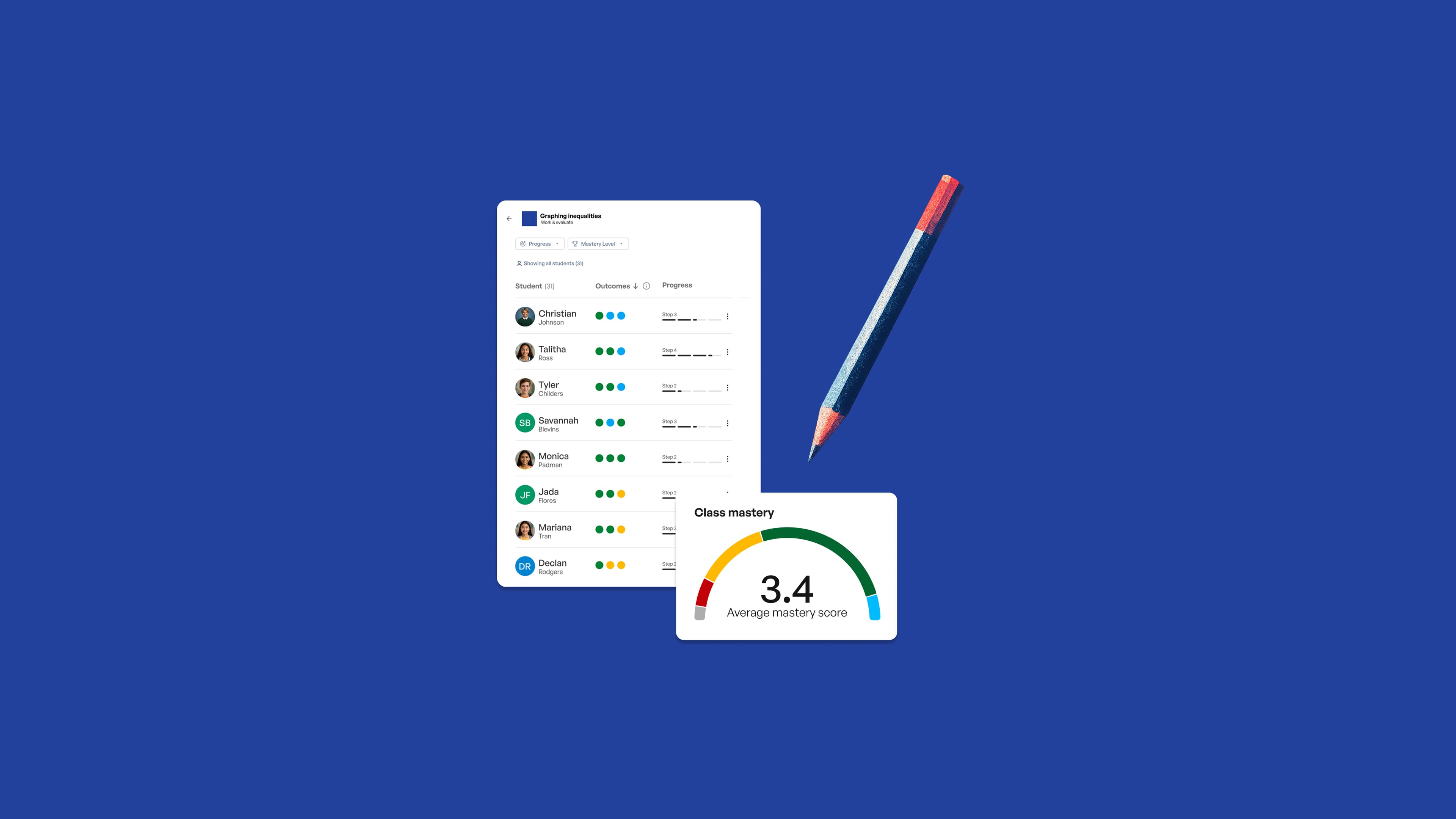
SchoolAI's Mission Control dashboard integrates this entire process, combining live insights and mastery tracking in one place so you can focus on creating learning experiences that make school awesome for every student, every day. Try SchoolAI today and turn your classroom data into student success stories.
Key takeaways
-
Begin with just one pillar of the framework that addresses your most pressing challenge, then gradually incorporate the others.
-
Classroom data is only valuable when it leads to specific instructional moves that support student learning.
-
Weekly PLC meetings with simple agendas (goal review → evidence share → next steps) establish the rhythm for sustainable data practices.
-
Track only 2-3 metrics tied to your priority standards rather than collecting everything. This reduces cognitive load and targets high-impact skills.
-
Use color-coding, simple charts, and clear visuals to make patterns immediately apparent to everyone on your team.
-
Disaggregate results by student subgroups to identify and address opportunity gaps that might otherwise remain hidden.
-
Always close the feedback loop with a brief post-intervention check to ensure your data-informed adjustments are making a difference.
Transform your teaching with AI-powered tools for personalized learning
See how every student is doing, and know what to do next.